
A website redesign that enhances brand alignment and elevates user experience
Chokyo is a growing online business offering beautifully designed pet goods; however, its current website doesn't fully reflect this. This redesign will align the site with Chokyo’s refined brand identity, enhancing customer engagement and retention.
Role
UX Researcher, UX/UI Designer
Toolkit
Figma, Figjam, Pencil + Paper
Date
October 2024
Responsibilities
-
User research & interviews
-
User flows & information architecture
-
Low and high fidelity prototyping
-
Usability studies
-
Iterating on designs
-
Accounting for accessibility
-
Responsive design for mobile, tablet & desktop
THE PROBLEM
Chokyo is a small business offering a range of high-quality, beautifully crafted pet products sourced globally. Their selection includes carefully curated aesthetically pleasing items that set them apart from typical Australian pet stores. However, the current website’s outdated design and challenging navigation undermine the premium experience they aim to provide, making the brand appear less refined than it is.
General User Sentiment
01
Perceived value - is it worth my money?
The products are cute but the branding feel cheap...
Are they actually good quality products?
02
Trust - will I get scammed?
Are they a legitimate company?
Are these products safe for my pet?
03
Confusion - this doesn’t make sense...
Why are the cat and dog items mixed together?
The product names are so wordy what is this exactly?
THE SOLUTION
Redesign and restructure the Chokyo website to create a smoother, more enjoyable user experience that better reflects the brand and its products.
Addressing User Needs
01
Consistent site design that reflects the branding and price point
02
Intuitive navigation
03
Focused and clear hierarchy
04
More considered information architecture
05
Simplified text and titles for easier comprehension
RESEARCH
Understanding the user
.png)
THE PROBLEM
Chokyo is a small business offering a range of high-quality, beautifully crafted pet products sourced globally. Their selection includes carefully curated aesthetically pleasing items that set them apart from typical Australian pet stores.
However, the current website’s outdated design and challenging navigation undermine the premium experience they aim to provide, making the brand appear less refined than it is.
General User Sentiment
01
Perceived value - is it worth my money?
-
The products are cute but the branding feel cheap...
-
Are they actually good quality products?
02
Trust - will I get scammed?
-
Are they a legitimate company?
-
Are these products safe for my pet?
03
Confusion - this doesn’t make sense...
-
Why are the cat and dog items mixed together?
-
The product names are so wordy what is this exactly?
THE SOLUTION
Redesign and restructure the Chokyo website to create a smoother, more enjoyable user experience that better reflects the brand and its products.
Addressing User Needs
01
Consistent site design that reflects the branding and price point
02
Intuitive navigation
03
Focused and clear hierarchy
04
More considered information architecture
05
Simplified text and titles for easier comprehension
THE PROBLEM
Chokyo is a small business offering a range of high-quality, beautifully crafted pet products sourced globally. Their selection includes carefully curated aesthetically pleasing items that set them apart from typical Australian pet stores.
However, the current website’s outdated design and challenging navigation undermine the premium experience they aim to provide, making the brand appear less refined than it is.
General user sentiment
01
Perceived value - is it worth my money?
-
The products are cute but the branding feel cheap...
-
Are they actually good quality products?
02
Trust - will I get scammed?
-
Are they a legitimate company?
-
Are these products safe for my pet?
03
Confusion - this doesn’t make sense...
-
Why are the cat and dog items mixed together?
-
The product names are so wordy what is this exactly?
THE SOLUTION
Redesign and restructure the Chokyo website to create a smoother, more enjoyable user experience that better reflects the brand and its products.
Addressing user needs
01
Consistent site design that reflects the branding and price point
02
Intuitive navigation
03
Focused and clear hierarchy
04
More considered information architecture
05
Simplified text and titles for easier comprehension
The global pet market is booming.
According to Animal Medicines Australia, 69% of households in Australia keep pets and an estimated $33 billion is spent annually to keep them fed, happy and accessorised.
Aside from the rise in pet ownership, social media and a greater focus on pet health and wellness has also led to a trend of increased spending on these “fur babies.”
Research Goals
01
Understand the market
02
Understand user goals, behaviours, and expectations
03
Identify frustrations browsing and purchasing pet products
04
Identify features that would make a pet products website more user friendly
USER PERSONAS


The global pet market is booming.
According to Animal Medicines Australia, 69% of households in Australia keep pets and an estimated $33 billion is spent annually to keep them fed, happy and accessorised.
Aside from the rise in pet ownership, social media and a greater focus on pet health and wellness has also led to a trend of increased spending on these “fur babies.”
Research Goals
Understand the market
01
Understand user goals, behaviours, and expectations
02
Identify frustrations browsing and purchasing pet products
03
Identify features that would make a pet products website more user friendly
04
USER JOURNEY MAP
Based on the research that was conducted, a user journey map was developed to visually represent the persona's experience as they navigate the process of purchasing items for their pet on the Chokyo website.

A moderated usability study was carried out with 4 different participants to assess how easy it was for users to browse for and check out items.
USER RESEARCH
“I just wanted to browse through cat toys I’m not sure why the dog toys are also mixed within this category - these aren’t relevant to me at all.”
“The website is so busy...why are there so many pop ups and buttons? And what’s with the trippy transitions for the homepage images? Everything feels so overwhelming”
“I mean, they have a really nice range of products but everything is displayed in such a cluttered and disorganised way. Reminds me of a bargain store. ”
USER RESEARCH
A moderated usability study was carried out with 4 different participants to assess how easy it was for users to browse for and check out items.


IDEATION
Starting the design

Empathise
Define
Ideate
Test
Prototype
USER RESEARCH
A moderated usability study was carried out with 4 different participants to assess how easy it was for users to browse for and check out items.
“I just wanted to browse through cat toys I’m not sure why the dog toys are also mixed within this category - these aren’t relevant to me at all.”
“The website is so busy...why are there so many pop ups and buttons? And what’s with the trippy transitions for the homepage images? Everything feels so overwhelming”
“I mean, they have a really nice range of products but everything is displayed in such a cluttered and disorganised way. Reminds me of a bargain store. ”
INFORMATION ARCHITECTURE
ORIGINAL SITE MAP STRUCTURE
The current website’s navigation and structure are overly complex and confusing for users:
-
Top navigation bar has an extensive drop-down list, making it difficult to quickly locate specific items
-
Some categories direct to the same page, mixing various product types, which creates confusion
-
The labelling is also inconsistent: certain labels are overly long and span two lines, disrupting readability, while others are ambiguously worded, leaving users unsure of their purpose
-
Non-essential elements, such as the blog—which has sparse, infrequent posts—occupy prime space in the top navigation, crowding out more relevant options

NEW SITE MAP STRUCTURE
A new structure was implemented to reduce cognitive load and create a smoother, more intuitive navigation experience:
Subcategories were added to the drop-down menu, allowing users to quickly locate what they need
Categories now have dedicated pages to avoid mixing different product types
Labels have been simplified for clarity and readability
Navigation has been streamlined to focus on key items

USER FLOW INTERACTION

PAPER WIREFRAMES
Rough sketches were created for the primary desktop and mobile pages to explore early concepts on content layout
HOMEPAGE

BROWSING

PRODUCT

CHECKOUT

CONFIRMATION

LOW-FI WIREFRAMES
The initial paper wireframes were then iteratively refined and translated into low-fidelity wireframes in Figma.
HOMEPAGE
DROP DOWN MENU
BROWSING CATEGORIES
CART


CONFIRMATION

CHECKOUT
Starting the design
IDEATION

IDEATION
Starting the design

EVALUATION & ITERATION
Usability testing & refining the design
Empathise
Define
Ideate
Test
Prototype
USER TESTING
Usability studies were conducted with four different participants who were asked to ‘think aloud’ as they went through the primary user journey of checking out a product.
-
To figure out if the layout and navigation is clear, intuitive and easy to use
-
To see whether the process is consistent with user expectations
-
To uncover pain points and product opportunities
RESEARCH GOALS
AFFINITY MAP

PAPER WIREFRAMES
Rough sketches were created for the primary desktop and mobile pages to explore early concepts on content layout
HOMEPAGE

BROWSING

PRODUCT

CHECKOUT

CONFIRMATION

LOW-FI WIREFRAMES
The initial paper wireframes were then iteratively refined and translated into low-fidelity wireframes in Figma.
CONFIRMATION

CART

CHECKOUT
BROWSING CATEGORIES

DROP DOWN MENU

HOMEPAGE

PAPER WIREFRAMES
Rough sketches were created for the primary desktop and mobile pages to explore early concepts on content layout


LOW-FI WIREFRAMES
The initial paper wireframes were then iteratively refined and translated into low-fidelity wireframes in Figma.
HI-FIDELITY DESIGNS
HOMEPAGE
-
Clean, proportionate navigation bar featuring essential pages
-
Vague or unfamiliar categories such as ‘custom products’ explained in illustrated banner
-
Curated categories for quick and easy browsing
-
Organized grid layout with large images and banners to create visual breaks
-
Thoughtful and refined colour palette to create a premium aesthetic

OLD DESIGN

NEW DESIGN
DROP DOWN MENU
-
Categories are sorted under sub headings for quick and easy navigation
-
Background is greyed out so the drop down menu stands out as the primary focus
-
Full-width dropdown menu is cleaner and more readable

OLD DESIGN

NEW DESIGN
BROWSING CATEGORIES
-
Banner along the top to denote category
-
Categories are kept separate to avoid confusion
-
Neat grid layout with larger images
-
Products have star ratings to help guide users

OLD DESIGN

NEW DESIGN
PRODUCT DETAILS
-
Simplified labelling
-
Neat layout with clear hierarchy
-
Larger images
-
Customer reviews at the bottom for user reference

OLD DESIGN

NEW DESIGN
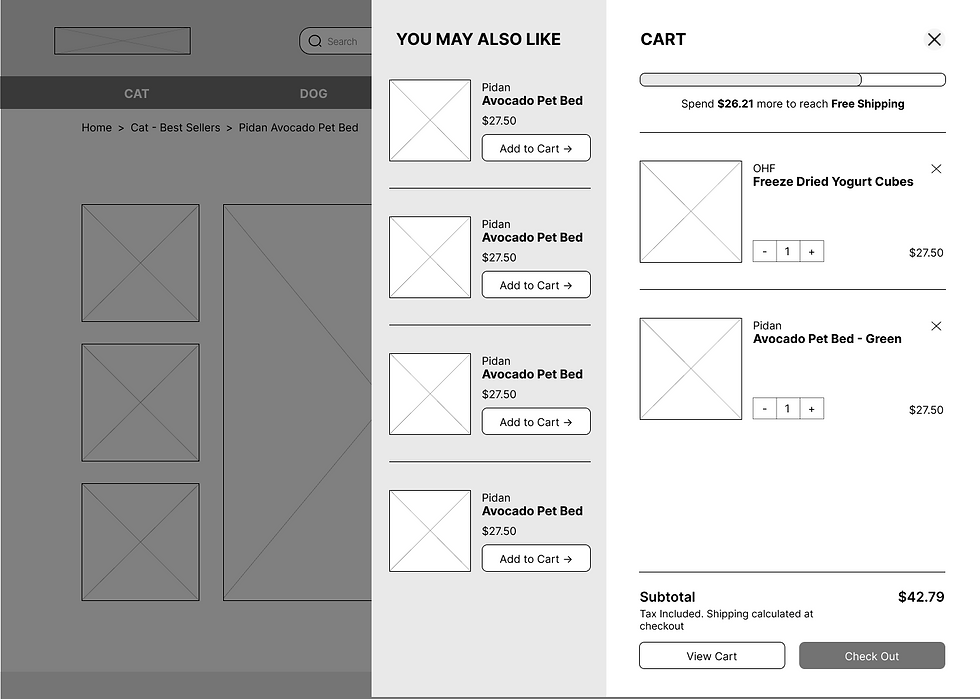
ADD TO CART
-
Removed unnecessary pop ups
-
Ensuring no elements overlap which make it difficult to interact with
-
Suggested products to inspire users

OLD DESIGN

NEW DESIGN
CHECKOUT
-
Updated colours for consistent feel throughout
-
Spaced out product display for greater readability
-
More obvious back button

OLD DESIGN

NEW DESIGN
CONFIRMATION
-
Consistent design to make the website and branding feel more holistic
-
Point of contact for anyone that has queries
-
Incentive to create an account and to invite friends

OLD DESIGN

NEW DESIGN
EVALUATION & ITERATION
Usability testing & refining the design

EVALUATION & ITERATION
Usability testing & refining the design


USER TESTING
Usability studies were conducted with four different participants who were asked to ‘think aloud’ as they went through the primary user journey of checking out a product.
RESEARCH GOALS
-
To figure out if the layout and navigation is clear, intuitive and easy to use
-
To see whether the process is consistent with user expectations
-
To uncover pain points and product opportunities
AFFINITY MAP


DESIGN SYSTEM

HI-FIDELITY DESIGNS
HOMEPAGE
-
Clean, proportionate navigation bar featuring essential pages
-
Vague or unfamiliar categories such as ‘custom products’ explained in illustrated banner
-
Curated categories for quick and easy browsing
-
Organised grid layout with large images and banners to create visual breaks
-
Thoughtful and refined colour palette to create a premium aesthetic
OLD DESIGN

NEW DESIGN

DROP DOWN MENU
-
Categories are sorted under sub headings for quick and easy navigation
-
Background is greyed out so the drop down menu stands out as the primary focus
-
Full-width dropdown menu is cleaner and more readable
OLD DESIGN

NEW DESIGN

BROWSING CATEGORIES
-
Banner along the top to denote category
-
Categories are kept separate to avoid confusion
-
Neat grid layout with larger images
-
Products have star ratings to help guide users
OLD DESIGN

NEW DESIGN

PRODUCT DETAILS
-
Simplified labelling
-
Neat layout with clear hierarchy
-
Larger images
-
Customer reviews at the bottom for user reference
OLD DESIGN

NEW DESIGN

ADD TO CART
-
Removed unnecessary pop ups
-
Ensuring no elements overlap which make it difficult to interact with
-
Suggested products to inspire users
OLD DESIGN

NEW DESIGN

CHECKOUT
-
Updated colours for consistent feel throughout
-
Spaced out product display for greater readability
-
More obvious back button
OLD DESIGN

NEW DESIGN

CONFIRMATION
-
Consistent design to make the website and branding feel more holistic
-
Point of contact for anyone that has queries
-
Incentive to create an account and to invite friends
OLD DESIGN

NEW DESIGN

HI-FIDELITY DESIGNS
HOMEPAGE
-
Clean, proportionate navigation bar featuring essential pages
-
Vague or unfamiliar categories such as ‘custom products’ explained in illustrated banner
-
Curated categories for quick and easy browsing
-
Organized grid layout with large images and banners to create visual breaks
-
Thoughtful and refined colour palette to create a premium aesthetic


BROWSING CATEGORIES
-
Banner along the top to denote category
-
Categories are kept separate to avoid confusion
-
Neat grid layout with larger images
-
Products have star ratings to help guide users


PRODUCT DETAILS
-
Simplified labelling
-
Neat layout with clear hierarchy
-
Larger images
-
Customer reviews at the bottom for user reference


ADD TO CART
-
Removed unnecessary pop ups
-
Ensuring no elements overlap which make it difficult to interact with
-
Suggested products to inspire users


DROP DOWN MENU
-
Categories are sorted under sub headings for quick and easy navigation
-
Background is greyed out so the drop down menu stands out as the primary focus
-
Full-width dropdown menu is cleaner and more readable


CHECKOUT
-
Updated colours for consistent feel throughout
-
Spaced out product display for greater readability
-
More obvious back button


CONFIRMATION
-
Consistent design to make the website and branding feel more holistic
-
Point of contact for anyone that has queries
-
Incentive to create an account and to invite friends


RESPONSIVE DESIGN
A webpage that adapts seamlessly to different screen sizes is essential. As more people browse on mobile devices and tablets, responsive design ensures the site remains convenient and accessible. This approach not only improves user experience but also helps drive more traffic to the site.

DESKTOP

TABLET
MOBILE

ACCESSIBILITY CONSIDERATIONS
Landmarks
Navigation bars, search boxes and footers define key areas of the interface. This aids assistive technologies by offering navigation cues, enabling users to move efficiently between sections.
Screen Reader technology
Establishing a clear typographic hierarchy with accessible markup, like heading tags and labels, enables screen readers to identify key content.
Responsive Design
Users access the website from various devices of different sizes. When they zoom in or adjust font size, the page dynamically resizes and repositions elements to fit the updated screen dimensions.
Alt Text
Enables users with visual impairments to understand the content of images through screen readers. It also benefits users with slow internet connections, providing context even if images fail to load
GOING FORWARD
Reflecting on this project made me realise how crucial a website is in conveying a brand’s values and shaping how its products are perceived. Even exceptional, unique products may struggle if the platform fails to effectively communicate their value, limiting the business’s success.
Engaging in in-depth conversations with users about their pain points helped me identify strategies to create a smoother, more holistic user experience that enhances the visibility and impact of the products.
Conduct follow-up usability studies - especially on the tablet and mobile prototypes to ensure the user experience is optimised for all platforms
01 FURTHER TESTING
Expand and showcase the blog with more frequent, informative posts on pet health, training, nutrition, and grooming to educate pet owners and drive organic traffic.
02 DEVELOP AND SHOWCASE BLOG
Encourage social sharing with pet-themed hashtags, and feature user-generated content on product pages or the home page to build community engagement and boost visibility.
03 SOCIAL MEDIA INTEGRATION
Next Steps
RESPONSIVE DESIGN
A webpage that adapts seamlessly to different screen sizes is essential. As more people browse on mobile devices and tablets, responsive design ensures the site remains convenient and accessible. This approach not only improves user experience but also helps drive more traffic to the site.
DESKTOP

TABLET

MOBILE

RESPONSIVE DESIGN
A webpage that adapts seamlessly to different screen sizes is essential. As more people browse on mobile devices and tablets, responsive design ensures the site remains convenient and accessible. This approach not only improves user experience but also helps drive more traffic to the site.


THANKYOU!
ACCESSIBILITY CONSIDERATIONS
Landmarks
Navigation bars, search boxes and footers define key areas of the interface. This aids assistive technologies by offering navigation cues, enabling users to move efficiently between sections.
Responsive design
Users access the website from various devices of different sizes. When they zoom in or adjust font size, the page dynamically resizes and repositions elements to fit the updated screen dimensions.
Screen reader technology
Establishing a clear typographic hierarchy with accessible markup, like heading tags and labels, enables screen readers to identify key content.
Alt text
Enables users with visual impairments to understand the content of images through screen readers. It also benefits users with slow internet connections, providing context even if images fail to load
ACCESSIBILITY CONSIDERATIONS


EVALUATION
Through heuristic evaluation of the current website and user testing, four key issues were identified:

GOING FORWARD
Reflecting on this project made me realise how crucial a website is in conveying a brand’s values and shaping how its products are perceived. Even exceptional, unique products may struggle if the platform fails to effectively communicate their value, limiting the business’s success.
Engaging in in-depth conversations with users about their pain points helped me identify strategies to create a smoother, more holistic user experience that enhances the visibility and impact of the products.
Next Steps
01 Further testing
Conduct follow-up usability studies - especially on the tablet and mobile prototypes to ensure the user experience is optimised for all platforms
02 Develop and showcase blog
Expand and showcase the blog with more frequent, informative posts on pet health, training, nutrition, and grooming to educate pet owners and drive organic traffic.
03 Social media integration
Encourage social sharing with pet-themed hashtags, and feature user-generated content on product pages or the home page to build community engagement and boost visibility.
Reflecting on this project made me realise how crucial a website is in conveying a brand’s values and shaping how its products are perceived. Even exceptional, unique products may struggle if the platform fails to effectively communicate their value, limiting the business’s success.
Engaging in in-depth conversations with users about their pain points helped me identify strategies to create a smoother, more holistic user experience that enhances the visibility and impact of the products.


