Sheike’s bold new look addresses multiple challenges through a service design approach, transforming not just the store aesthetic but the entire customer journey.
By aligning the design with the brand identity, rethinking underperforming fixtures, and improving key touchpoints in the shopping experience, the new concept elevates both the store environment and the way customers interact with the brand.
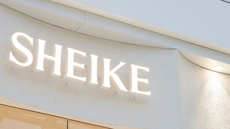
Client
Sheike
Role
Interior + Service Designer
Toolkit
Sketching, Vectorworks, Twinmotion
Responsibilities
Client consultation and needs assessment
Customer experience research
Space planning and concept development
Materials, furnishings, and fixture selection
Project coordination and design documentation
Building code and accessibility compliance
Fixture manufacturing coordination
Optimising customer touchpoints and in-store experience
A refreshed concept rollout of a popular fashion retailer
Sheike’s bold new look tackles several existing challenges, including a store aesthetic that doesn’t align with the brand identity, underperforming fixtures, and a shopping experience that falls short of reflecting the quality of their products.

Client
Sheike
Role
Interior Designer
Toolkit
Sketching, Vectorworks, Twinmotion
Date
February 2024
Responsibilities
-
Client consultation & needs assessment
-
Customer experience research
-
Space planning
-
Concept development
-
Materials and furnishings
-
Project coordination
-
Design documentation
-
Building code and accessibility compliance
-
Fixture detail and manufacture coordination

CONTEXT & CHALLENGE
Sheike, a contemporary fashion retailer, sought to elevate the in-store experience to align with their brand's modern and sophisticated aesthetic. Beyond aesthetics, the goal was to create a seamless and engaging shopping journey that enhances customer satisfaction, staff efficiency, and overall brand perception.


THE BRIEF
The brief we received involved a new look and concept upgrade for Sheike stores, beginning with their boutique at Chadstone Shopping Centre in Melbourne. We were tasked with planning the staged rollout of the redesign for both new and existing stores, in both partial and complete phases. This included introducing a new range of fixtures that would offer greater flexibility and exploring opportunities to improve store flow and operational efficiency.
USER RESEARCH
The first step of the process was to conduct in-depth research to understand the problem more holistically
01
Observations of customer behaviors within the store.
02
Interviews with staff to understand operational pain points.
03
Customer feedback to identify common frustrations and expectations.


“I use to always pass by the physical stores thinking they sold boring office wear. It wasn’t until I looked at the dresses properly that I realised they have really fancy event clothing”
- Customer
“I don’t really like their change rooms ... the curtains are really hard to drag across, I trip over the heels they have on the floor and there’s not enough places to hang stuff”
- Customer
"The fixtures are very limiting...I can only put certain products in certain areas which is annoying when we want to try something new or a bit different"
- Staff
To identify key issues, we conducted research, visiting four of their existing stores to observe customer behaviour while they shopped. Afterward, we interviewed them to gather insights on their experience.
USER RESEARCH
“I use to always pass by the physical stores thinking they sold boring office wear. It wasn’t until I looked at the dresses properly that I realised they have really fancy event clothing”
“I don’t really like their change rooms ... the curtains are really hard to drag across, I trip over the heels they have on the floor and there’s not enough places to hang stuff”
“They have nice jewellery but I always forget about this until I’m at the checkout counter. By then, I can’t be bothered to ask the staff to take them out from the counter...”
Sheike’s branding is vibrant, bold, empowering, and joyful, perfectly reflecting their high-quality products and frequently updated range. However, this is undermined by the current in-store experience, which feels visually outdated and fails to communicate the brand’s energetic message.
THE PROBLEM
General user sentiment
Fitout misalignment with branding
01
-
Looks old and outdated
-
Gives an office-wear vibe
-
Feels cheap
Subpar store experience
02
-
Poor lighting
-
Unremarkable visual merchandising
-
Cold and uninviting change rooms
Missed opportunities
03
-
Jewellery section feels like an afterthought
-
Current fixtures limit product display
-
Poor integration of technology like screens
A complete redesign and rollout of stores that enhances the in-store experience, aligning with the brand and creating a space where customers feel confident, happy, and connected to the brand in a meaningful way.
THE SOLUTION
Addressing user needs
Store design concept to align with branding
01
New set of fixtures that can showcase the wide range of products
02
Redesign layout to streamline customer flow
03
Redesign lighting to elevate store ambience and product display
04
Integration of screens for flexibility in showcasing campaign material
05
USER JOURNEY MAP
A customer journey map was created across three key phases

This helped to visualise the end-to-end customer experience, identifying pain points and uncovering opportunities to improve service quality and customer satisfaction across all touchpoints.
THE PROBLEM
Key findings revealed several challenges within the in-store experience, including difficulties in store navigation, ineffective engagement touchpoints, and overall discomfort, all of which present an opportunity for a service-oriented spatial redesign.
While Sheike’s branding is vibrant, bold, empowering, and joyful, reflecting the high quality and constantly updated product range, the current store design fails to communicate this energetic message, appearing visually outdated.
Additionally, operational inefficiencies, poor flow, and suboptimal fixture performance further hinder the brand’s potential, highlighting the need for a comprehensive redesign.
Key painpoints
01
Fitout misalignment with branding
-
Looks old and outdated
-
Gives an office-wear vibe
-
Feels cheap
02
Subpar store experience
-
Poor lighting
-
Unremarkable visual merchandising
-
Cold and uninviting change rooms
03
Operational inefficiencies
-
Subpar fixture performance
-
Inefficient circulation / unintuitive layouts
-
Poor integration of technology like screens
THE SOLUTION
A complete redesign and rollout of stores that enhances the in-store experience, aligning with the brand and creating a space where customers feel confident and connected to the brand in a meaningful way.
This holistic approach also focuses on improving the environment for staff, ensuring their workspaces are efficient, comfortable, and conducive to delivering exceptional service, ultimately fostering a positive experience for both customers and employees.
Addressing user needs
01
Store design concept to align with branding
02
Redesign fixtures that optimise use
03
Reconfigure layouts to streamline user flow
04
Redesign lighting to elevate store ambience and product display
05
Introduce digital touchpoints to elevate instore experience

IDEATION
During the ideation phase, we identified key insights that would drive design decisions. Instead of treating the store as an isolated space, we positioned it as a crucial touchpoint within Sheike's broader omnichannel experience.
01
Wayfinding
Implementing subtle zoning through lighting, materiality, and signage
02
Engagement touchpoints
Introducing accessories in the fitting room to encourage styling while trying on outfits
03
Fitting room expereince
Imparting premium feel with materials,thoughtful details and considered lighting
04
Online-to-offline transitions
Click-and-collect areas, digital lookbooks in-store
05
Staff empowerment
Efficient layouts that reduce friction in customer assistance
06
Emotional connection
Sensory design elements that reinforce Sheike’s brand identity
In addition to shaping the overall customer experience, I was tasked with developing a concept to frame the interior design and align it more closely with the existing branding.
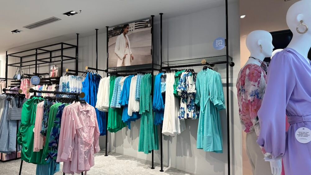
The concept centers around conchoidal, scalloped forms that evoke a sense of embrace, reflecting Sheike's values of love, social connection, detail, and timelessness. Taking a museum-like approach, the space serves as a canvas, with modular frames seamlessly highlighting the products. The carefully chosen terracotta color is bright, feminine, and European-inspired, complementing Sheike's branding. Warm, natural materials create an inviting, polished, and aspirational atmosphere.

SKETCHES
Rough sketches were created to explore early layouts, forms and fixtures

RENDERS & DRAWINGS
The sketches were then developed into renders and construction drawings to flesh out the details


The concept is centred around conchoidal forms, with a scalloped shape that evokes a sense of enveloping or embracing. This design reflects Sheike’s brand values—loving, social, detailed, and timeless.
Taking a museum-like approach, the base acts as a blank canvas, pushing the products to the foreground. Modular frames, seamlessly blending into the background, provide numerous ways to showcase items thoughtfully.
The terracotta colour, selected after careful consideration, is bright, welcoming, and feminine, evoking a European feel that aligns perfectly with Sheike’s branding. Warm, natural tones and materials create an inviting atmosphere, exuding a polished, aspirational vibe.
THE CONCEPT

Rough sketches were created to explore early layouts, forms and fixtures
SKETCHES

The sketches were then developed into renders and construction drawings to flesh out the details
RENDERS & DETAILS


RESULTS & IMPACT
The goal was to create a seamless and engaging shopping experience that enhances customer satisfaction, staff efficiency, and overall brand perception. Taking a holistic approach with service design principles, the redesign resulted in:
01
Increased dwell time as customers engaged with more interactive zones
02
Enhanced staff efficiency with improved layout and visibility
03
Higher conversion rates due to a more intuitive and inviting shopping flow.
"The store also looked immaculate even though it was super busy!" - Enhanced circulation and flow, effectively handling high traffic while maintaining a polished, organised appearance.
"Unfortunately the items I wanted were not available in store so I will purchase online, however I will travel to shop in this store again as it was such a pleasant experience!" - Upgraded store experience created a positive enough impression to encourage future visits, even if purchases were made online.
"The new fixture system gives me so much flexibility when deciding how to display the products" - Empowered staff to display products more effectively, enhancing product presentation and creating a more dynamic shopping environment.
KEY TAKEAWAYS
By integrating service design thinking, this project transformed Sheike’s store from a transactional space into a holistic brand experience. It highlights how interior design, when strategically aligned with customer needs and business goals, goes beyond aesthetics to drive engagement and brand loyalty.
In retrospect, a more co-creative approach—actively involving staff and potential customers in ideation—could have further enriched the design through iterative feedback.