
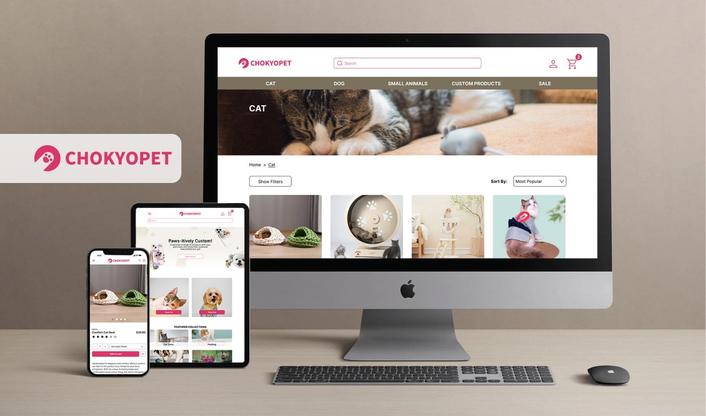
Webpage UX/UI Redesign · 2024
Chokyo
A website redesign that enhances brand alignment and elevates the user experience - aligning the site with Chokyo’s refined brand identity to improve customer engagement and retention.
Role
UX Researcher, UX/UI Designer
Toolkit
Figma, FigJam, Pencil + Paper
Date
October 2024
Responsibilities
- User research & interviews
- User flows & IA
- Low & high-fidelity prototyping
- Usability studies
- Iterating on designs
- Accessibility
- Responsive design
The Problem
The problem
A premium brand let down by its site
Chokyo is a small business offering high-quality, beautifully crafted pet products sourced globally - a curated, aesthetically-driven range that sets it apart from the typical Australian pet store. But the site’s outdated design and awkward navigation undermined the premium experience, making the brand look less refined than it is.
General user sentiment
Perceived value - is it worth my money?
- The products are cute but the branding feels cheap…
- Are these actually good-quality products?
Trust - will I get scammed?
- Are they a legitimate company?
- Are these products safe for my pet?
Confusion - this doesn’t make sense…
- Why are the cat and dog items mixed together?
- The product names are so wordy - what is this, exactly?
The Solution
The solution
A smoother site that reflects the brand
Redesign and restructure the Chokyo website to create a smoother, more enjoyable experience that better reflects the brand and its products.
Addressing user needs
- A consistent site design that reflects the branding and price point.
- Intuitive navigation.
- A focused, clear hierarchy.
- A more considered information architecture.
- Simplified text and titles for easier comprehension.
Research
Understanding the user
A booming market of pampered pets
The global pet market is booming. According to Animal Medicines Australia, 69% of Australian households keep pets, with an estimated $33 billion spent each year keeping them fed, happy and accessorised.
Alongside rising ownership, social media and a growing focus on pet health and wellness have fuelled increased spending on these “fur babies.”
Research goals
What I set out to learn
User research
Hearing it in their own words
A moderated usability study with four participants assessed how easily people could browse for and check out items. The friction came through loud and clear:
I just wanted to browse cat toys - I’m not sure why the dog toys are mixed into this category. They aren’t relevant to me at all.
The website is so busy… why are there so many pop-ups and buttons? And what’s with the trippy transitions on the homepage images? Everything feels so overwhelming.
They have a really nice range of products, but everything is displayed in such a cluttered, disorganised way. It reminds me of a bargain store.
User journey map
Mapping the shopping journey
A journey map visualised the primary persona’s experience as they navigate the process of finding and purchasing items for their pet on the Chokyo site.
The Redesign
Information architecture
Untangling the structure
Original structure
- The top navigation bar had an extensive drop-down list, making it hard to locate specific items.
- Some categories directed to the same page, mixing product types and creating confusion.
- Labelling was inconsistent - some labels ran over two lines, others were ambiguously worded.
- Non-essential elements, like a sparse blog, occupied prime navigation space.
New structure
- Subcategories were added to the drop-down so users can quickly locate what they need.
- Categories now have dedicated pages, so product types are never mixed.
- Labels were simplified for clarity and readability.
- Navigation was streamlined to focus on the key items.
Synthesis
From observations to actions
Observations from the ‘think-aloud’ sessions were organised into an affinity diagram, surfacing the themes and the solutions that shaped the high-fidelity design.
Hi-fidelity designs
Old design vs. new
Working through the core journey page by page, the redesign brought consistency, clarity and a premium feel to every step. Click any screen to enlarge.
Homepage
- A clean, proportionate navigation bar featuring only the essential pages.
- Vague categories like “custom products” explained in an illustrated banner.
- Curated categories for quick, easy browsing.
- An organised grid with large images and banners for visual breaks.
- A refined colour palette for a premium aesthetic.
Drop-down menu
- Categories sorted under sub-headings for quick navigation.
- The background greys out so the menu becomes the primary focus.
- A full-width dropdown that’s cleaner and more readable.
Browsing categories
- A banner along the top denotes the category.
- Categories are kept separate to avoid confusion.
- A neat grid layout with larger images.
- Products carry star ratings to help guide users.
Product details
- Simplified labelling.
- A neat layout with a clear hierarchy.
- Larger product images.
- Customer reviews at the bottom for reference.
Checkout
- Updated colours for a consistent feel throughout.
- A spaced-out product display for greater readability.
- A more obvious back button.
Confirmation
- A consistent design so the site and branding feel holistic.
- A clear point of contact for anyone with queries.
- An incentive to create an account and invite friends.
Hi-fidelity prototype
Try the redesign yourself
The final screens were wired into an interactive prototype covering the full browse-to-checkout journey. Take it for a spin in Figma.
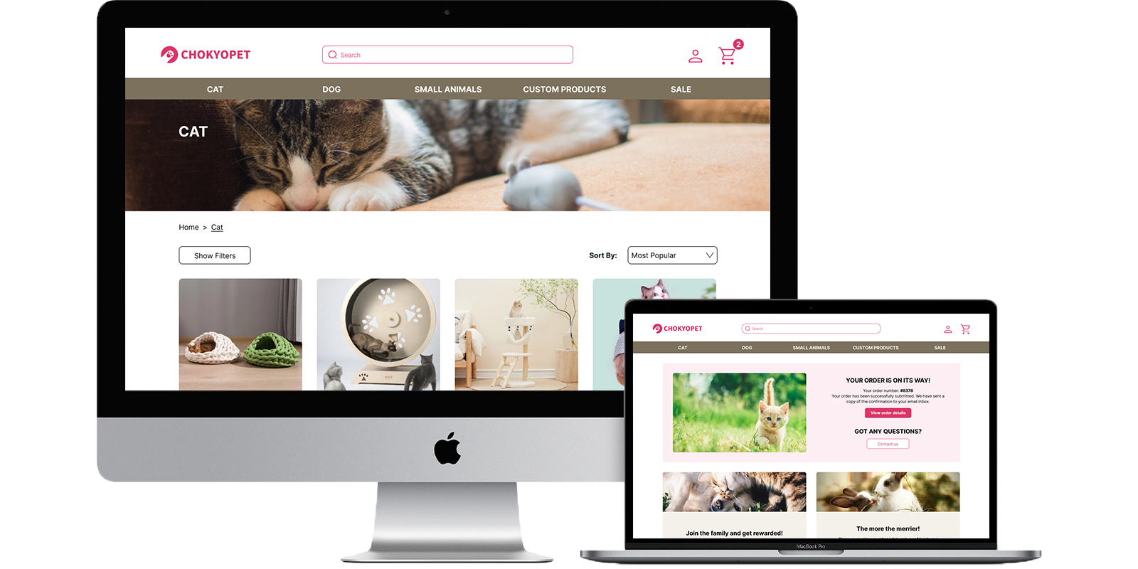
Design system & responsive
Consistent across every screen
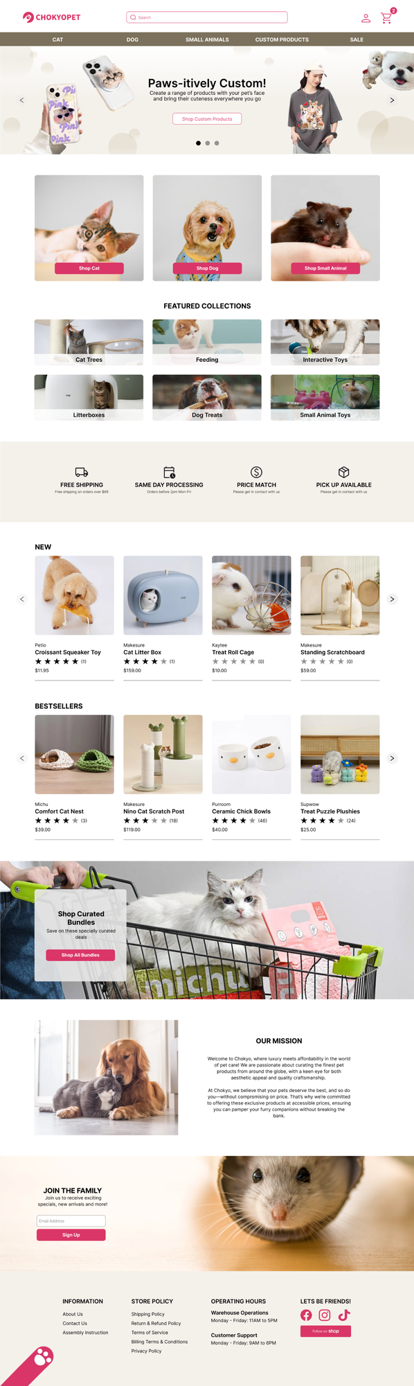
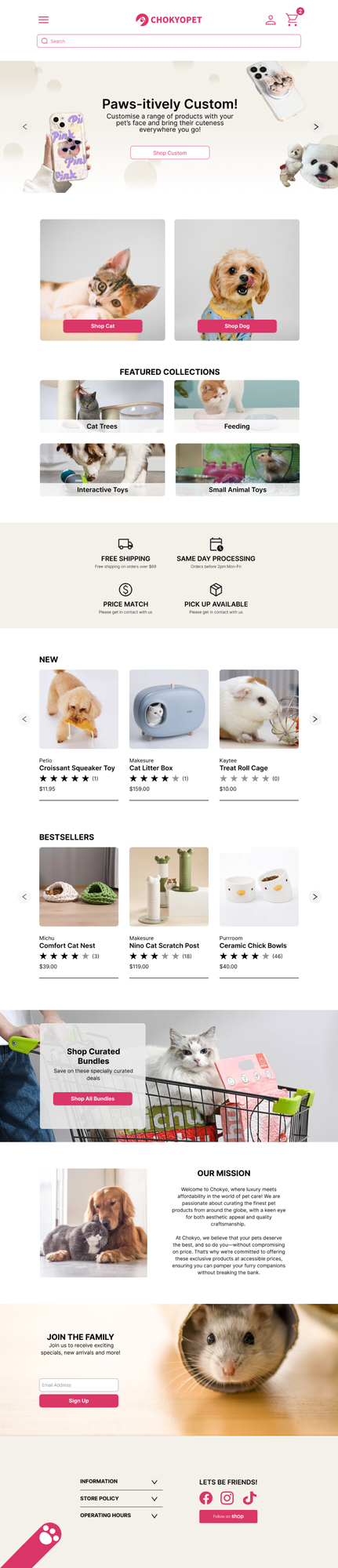
A design system kept the redesign cohesive, and a responsive approach means the site stays convenient and accessible however people browse - on desktop, tablet or mobile.

Accessibility considerations
Landmarks
Navigation bars, search boxes and footers define key regions, giving assistive tech clear cues to move between sections.
Screen reader
A clear typographic hierarchy with accessible markup - heading tags and labels - lets screen readers identify key content.
Responsive design
When users zoom or adjust font size, the page resizes and repositions elements to fit the updated screen dimensions.
Alt text
Lets users with visual impairments understand image content via a screen reader - and provides context if images fail to load.
Going Forward
Reflection
What I took away
This project made me realise how crucial a website is in conveying a brand’s values and shaping how its products are perceived. Even exceptional, unique products can struggle if the platform fails to communicate their value - limiting the business’s success.
Digging into users’ pain points helped me find ways to create a smoother, more holistic experience that lifts the visibility and impact of the products themselves.