
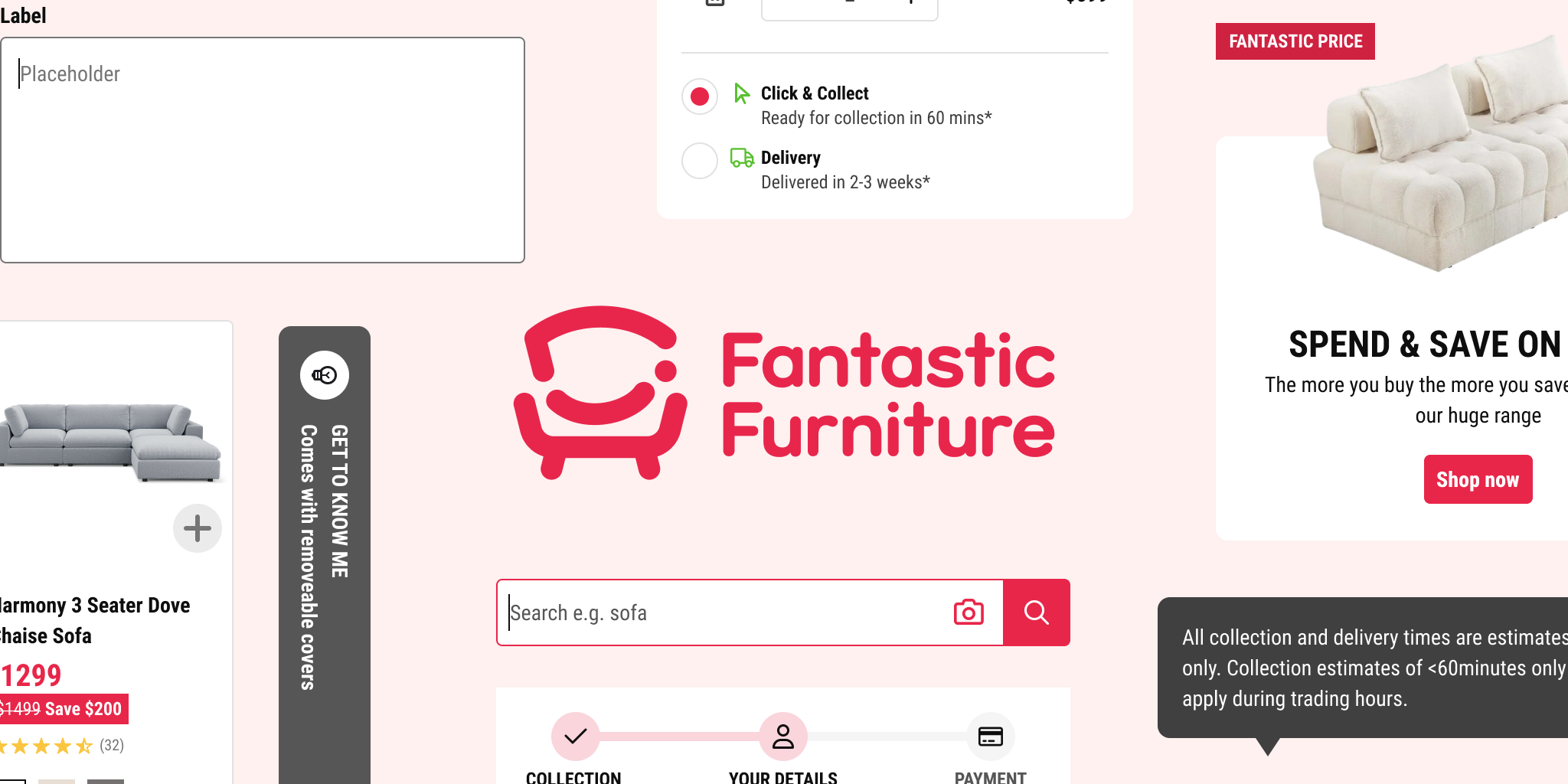
Design Systems · Fantastic Furniture · 2026
Design System
Turning one person’s Figma file into a connected, versioned design system the whole team builds from.
Role
Product Designer
Toolkit
Figma
Timeframe
2025 – 2026, alongside project work
Status
In use
What I owned
- Design system architecture
- Componentisation
- Versioning protocol
- File migration
- Cross-team enablement
- Documentation
Context
01 · Context
One designer, one file, everything in one place
Fantastic Furniture is one of Australia’s largest furniture retailers, with more than 80 stores nationally and a high-traffic e‑commerce site. I joined as its first product designer.
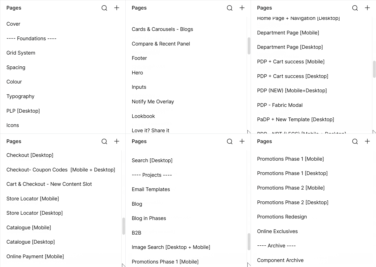
Until then, the website had been designed by one person - the e‑commerce manager - out of two Figma files: a working file and a dev-ready one. Everything lived in the working file, across dozens of pages: design system material, individual webpage work and larger project work all shared the same space, with components sitting wherever they’d been made - sometimes on their own page, sometimes buried inside the project they were built for.
There was no rule for what became a component and what stayed a loose element, and no protocol for updating or replacing one once it existed.
The problem
02 · The problem
The file’s state lived in one person’s head
None of that structure was written down, so the only way to know what was current was to ask the person who’d built it. That made the e‑commerce manager a single point of dependency, and it slowed us both. It wasn’t only me leaning on her memory - even she couldn’t always retrace where a past decision lived or which version was the latest. The knowledge sat with one person rather than in the file, where either of us could have looked it up.
Changes didn't propagate
- We updated the font, and old font still turned up across wireframes here and there.
- During the mini cart redesign I increased the header text size on the fly-in panel - but because it wasn’t a component, the change stopped there; every other fly-in kept the old size, and I didn’t catch it until later.
- Consistency depended on remembering.
No protocol for replacing a component
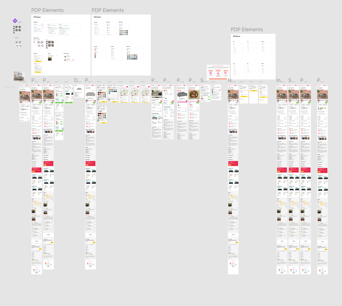
- When a component was replaced, a new version was created and just labelled “New” - the old one stayed exactly as it was.
- Nothing marked which was current, so there was no way to tell if I was reaching for the old one by mistake.
- Worse, the old version sat on a wireframe page that had since been deleted, while the new one was linked from a separate draft file - so tracking the real component was confusing.
Everything was built twice
- Desktop and mobile versions of the same element were separate components rather than variants of one, so every element I touched, I built twice.
- Their wireframes lived on separate pages too - checking a screen across breakpoints was a memory exercise.
Example - the BNPL component
The old version
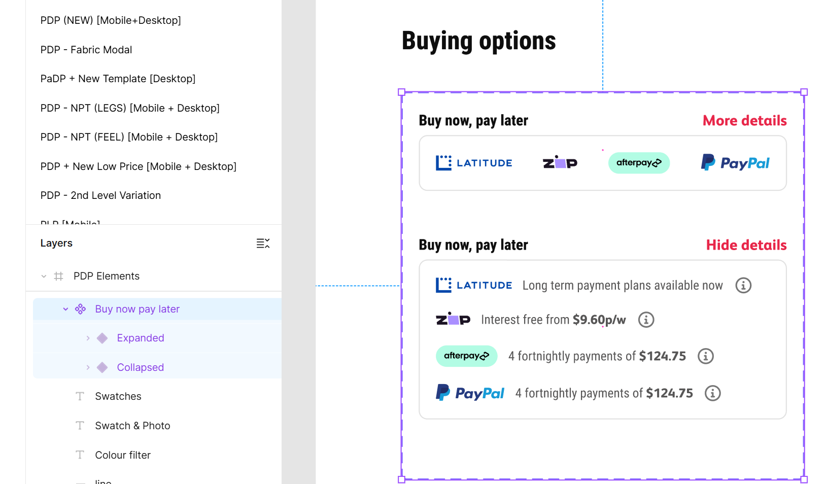
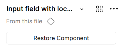
The new version
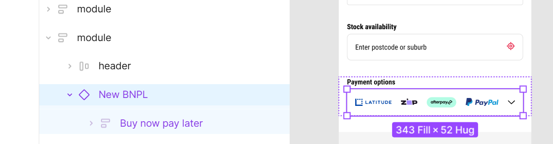
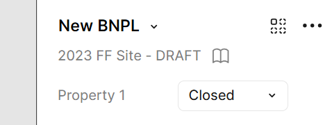
Nothing marks which is current, so it’s easy to reach for the wrong one.
What I did
03 · What I did
Giving components one home
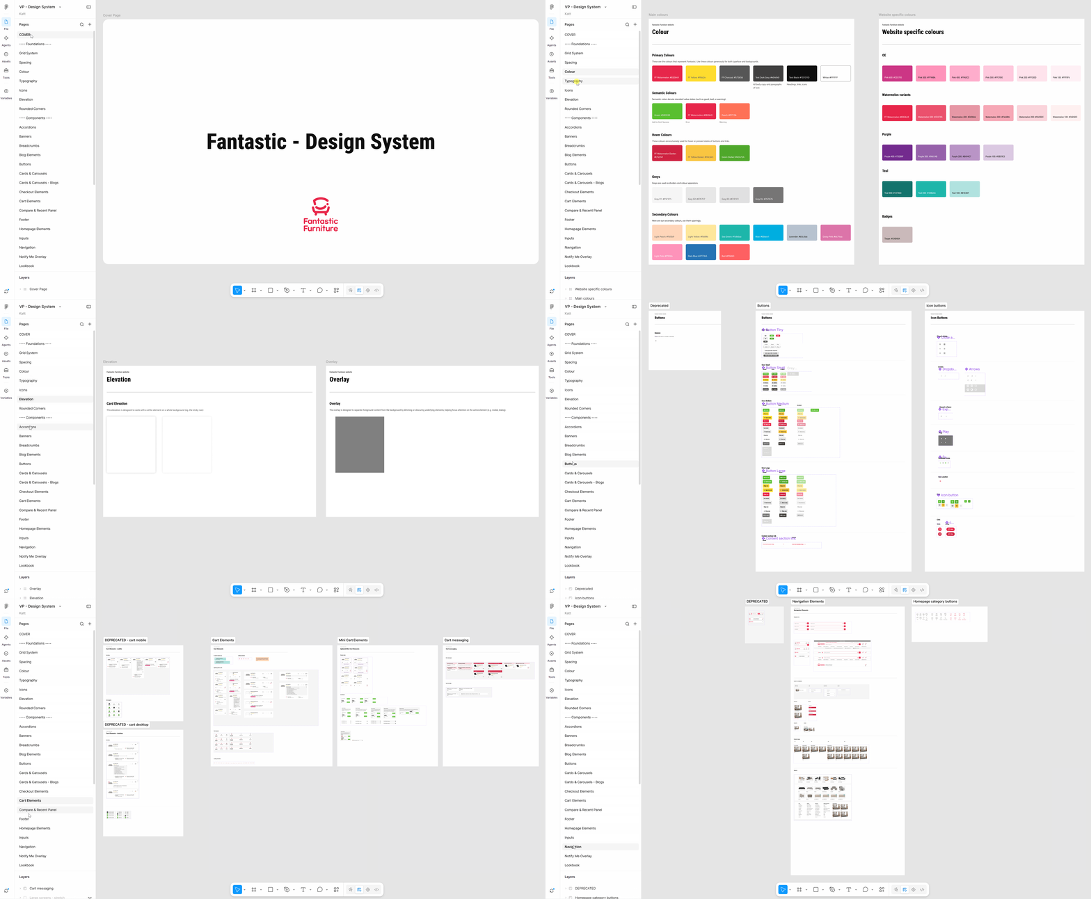
I moved the design system into its own file and connected it across every project file, so components had one home rather than living wherever they’d been made. Colour and text styles are set up as shared styles in the library, so a change to the brand palette or type scale flows through every component.
Core vs page-specific
Core components are the building blocks used across multiple touchpoints. Page-specific components serve one area of the site. The tier tells you what a change to it will affect.
What becomes a component
An element gets componentised if it’s used across multiple touchpoints, so consistency is enforced rather than remembered - or if it has many variations, so they’re easy to track and switch between. Complex components nest smaller ones inside them.
Mobile & desktop as variants
Breakpoints now live in the same component as variants rather than two separate builds. One element, one place to update it.
Deprecate, don't delete
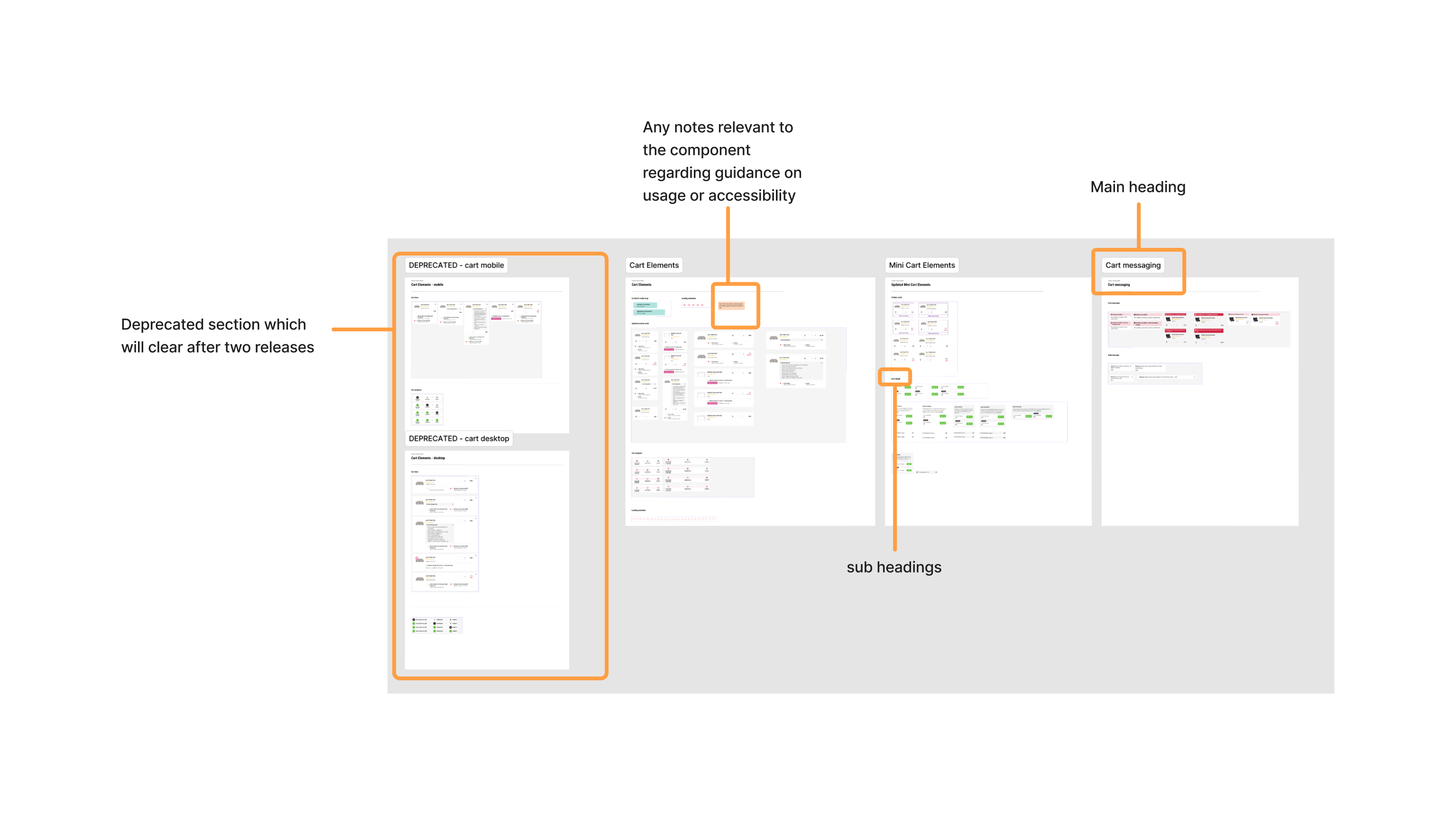
A minor change updates the component in place. A full rework becomes a new component, with the previous version marked DEPRECATED rather than deleted - so old wireframes still resolve and we can trace a decision back. Deprecated versions are cleared after two releases so the archive can’t grow the file back into the problem it solved.
I worked with the e‑commerce manager throughout rather than presenting a finished system. I floated proposals, we talked them through, and we agreed on the structure together. It had been her file and her way of working long before it was mine.
The migration ran alongside everything else - there was never a block of time set aside for it, so it happened two ways. I worked through the file page by page, taking a chunk whenever I had spare time between projects. And whenever a project brought me into contact with a broken or outdated component, I fixed that one on the spot rather than working around it.
Impact
04 · Impact
One source, four consumers
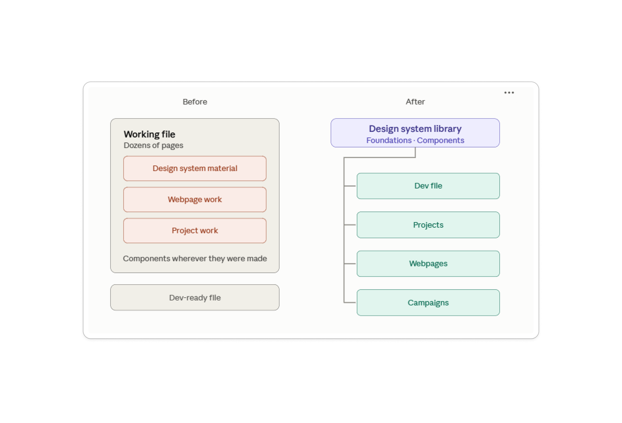
Four files now run off the library - the dev file, projects, webpages and campaigns. One source, four consumers.
Building is faster, most obviously across breakpoints. Moving a wireframe from mobile to desktop used to mean hunting down the other version of every element. Now it’s the same component with a variant switched.
It opened up work that wasn’t practical before. With states defined inside components, prototypes can link between them - so I can show an interaction rather than describe it.
It’s used well beyond design. Developers and BAs reference it, as do the e‑commerce manager, the digital content and campaign specialist, the digital merchandising coordinator, and the digital marketing manager. The campaign specialist previously had no reference for the standard mobile and desktop banner sizes we design to - now there’s one place to check them, and he builds or adjusts banners from it himself.
Reflection
05 · Reflection
What I’d question
Three things I’m still weighing up.
Deprecation may not scale
Keeping old versions marked DEPRECATED worked with one designer. With more, it could get messy - deleting after two releases is my guard, and I’m not sure it’s enough.
Ready for a team
As the only designer, I kept things light. A naming convention, a last-published date and a version on each component are what I’d add first as the team grows.
Styles, not tokens (yet)
We built on Figma colour and text styles rather than variables. For one designer and a dev team working from specs, that was enough. With more designers, or developers consuming values directly, moving to variables and tokens is the next step I’d take.