
Product Design · 2024
Evergarden
An app that aims to get rid of plant-care fears and woes for good - streamlining how people identify and solve houseplant problems, for everyone from budding green thumbs to veteran plant parents.
Role
UX Researcher, UX/UI Designer
Toolkit
Figma, FigJam, Pencil + Paper
Date
August 2024
Responsibilities
- User research & interviews
- User flows & IA
- Low & high-fidelity prototyping
- UI mockups
- Usability studies
- Iterating on designs
- Accessibility
The Problem
The problem
Plants are great - until they start dying
Trawling through countless websites to diagnose ambiguous symptoms while on a time crunch can drive anyone up the wall. Isn’t it easier to just toss the plant and buy a new one?
General user sentiment
Uncertain where to start
- How do I even begin to describe the problem?
- Where do I look?
- What sources can I trust?
Misdiagnosis from conflicting info
- Why do different sources say different things?
- All the symptoms sound the same to me
- How do I know I’ve deduced the issue correctly?
Time-poor, disposable-plant culture
- I don’t have time to sift through all this
- I don’t want to devote so much energy
- I can always chuck it out and start again
The Solution
The solution
Diagnosis and care, made simple
Design a mobile app that lets people quickly and easily make informed decisions about what’s wrong with their plant - with features to implement and track treatment, plus general plant care.
Addressing user needs
- An auto-diagnose camera feature that quickly returns clear result options.
- A step-by-step guided process with large visual references.
- Key information shown succinctly, expandable into more detail.
- The ability to save plants, set reminders, and track care or growth.
- An in-app forum and useful articles for further learning.
The mock-up
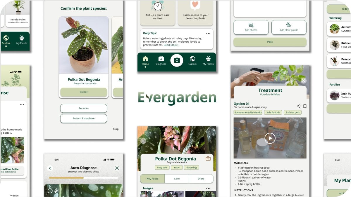
The key features of Evergarden

Welcome
- Quick, simple sign-up and log-in.
- The app’s feel is introduced through playful animation, a soft palette and graphics.

Diagnose & Treat
- “Auto-diagnose” is set apart in a unique green tone to guide users to the core function.
- A progress bar communicates and guides users along the process.
- Percentage-match indicators and key phrases help users make an informed choice.
- Results are digestible at a glance and expandable for detail.
Care
- Save plants and filter them by health for quick access.
- Learn each plant’s key facts.
- Set up care reminders.
- Track progress by adding photos and notes.
Learn
- A community forum to connect with like-minded people.
- Articles and guides to hone plant-care skills.
Research
Understanding the user
A booming market with a real gap
Houseplants have surged in popularity in recent years - a trend with no sign of slowing. In the wake of the pandemic, a desire to reconnect with nature has had more people putting on their gardening gloves.
I ran a series of user interviews and a competitive audit to build a deeper understanding of the target audience and their potential pain points. Interestingly, most interview participants weren’t using any plant-care app at all.
Research goals
What I set out to learn
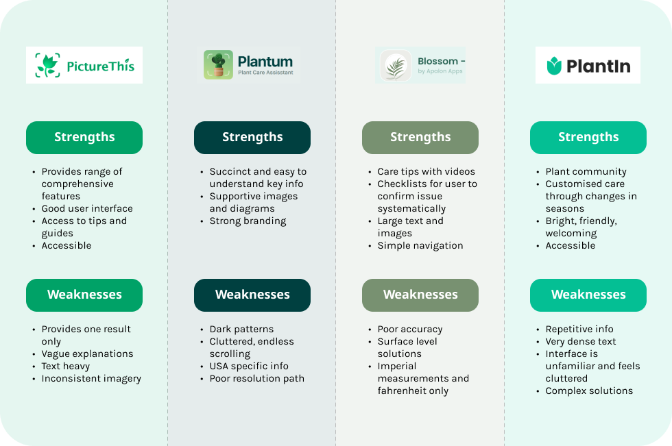
Competitive audit
Why people gave up on the existing apps
A competitive analysis of the popular plant-care apps surfaced the key reasons they weren’t sticking:
- An overwhelming amount of dense, hard-to-read information.
- No filtering for the diseases that make sense for a specific plant.
- Only ever providing one result.
- Not accessible - country-specific, differing units of measurement.
- Disease detection that is inaccurate, broad and vague.
- Lots of jargon with no explanation or references.
- Vague answers with no clear resolution path.
User research
Hearing it in their own words
I interviewed a spread of participants - from people who knew little about plant care to experts familiar with similar apps - to get a clear picture of their characteristics, goals and pain points.
It can be quite difficult to figure out what’s wrong with my plant - there’s a lot of information online that’s wordy and confusing, and my brain just switches off.
Google has a lot of answers but it takes time to check different websites… I’m time-poor and usually focus on other priorities before looking after the plants.
The bar is often set unrealistically high for care - I’m not going to mist my plants every day or mix my own optimised potting blend.
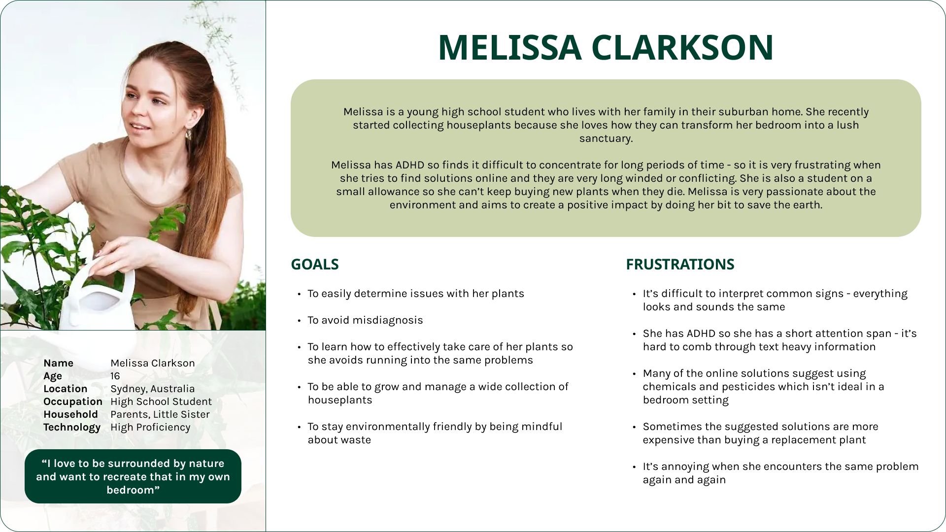
User personas
Three plant parents
Interviews were distilled into three personas. Because Evergarden set out to make plant care easy and accessible for everyone, Melissa - the confused beginner - was chosen as the primary persona, keeping the features intuitive for newcomers.
User journey map
Mapping the experience
A journey map visualised the primary persona’s experience as they move through discovering an issue, finding a tool, diagnosing, applying a solution and monitoring results.
Design & Iteration
Ideation
Starting with paper
From the research insights, Evergarden focused on three core capabilities. Preliminary wireframes mapped out and explored the key user flows before any pixels were pushed.
Detecting issues
Saving plants to track care
Learning & community
Evaluation & iteration
Usability testing & refining
A moderated usability study with 6 participants assessed how easily people could complete the core tasks. It set out to:
- Confirm the app reduces the time and complexity of pinpointing and resolving plant issues.
- Check the layout and navigation are clear, intuitive and easy to use.
- See whether the process matches user expectations.
- Find out if the tools, functions and information provided are genuinely useful.
- Uncover pain points and product opportunities.
Key insights
Clear cues
P05 of 6 participants were unsure about some buttons or missed them completely - users need better cues for what they can interact with.
Expert help
P06 of 6 struggled to access expert help and its notifications - the feature needs to be far more apparent and easier to reach.
Readability
P15 of 6 had issues with the text - too small, too dense - so information needed to be presented more sparingly.
Simplicity
P24 of 6 preferred a simpler layout - a cleaner interface makes the app easier to navigate.
Iterating on the design
From insight to interface
Each insight fed straight back into the high-fidelity screens - clearer cues, more accessible expert help, and information presented far more legibly.
Design system
A calm, consistent system
A design system kept the app cohesive - typography, colour, icons and components built around a soft, natural palette that keeps the focus on the plants.
Accessibility
Designed to be inclusive
Text-to-speech
A TTS button delivers information via audio for users with visual impairments, dyslexia or other reading challenges.
Jargon definitions
Plain-language definitions for difficult terms accommodate different levels of literacy.
Voice control
Lets users with motor impairments or conditions like arthritis search for results hands-free.
Haptics
Tactile feedback confirms actions and silently alerts users with auditory impairments to notifications.
Alt text
Lets users with visual impairments understand image content and context via a screen reader.
Screen reader
Reads out buttons, menus, links and other interactive elements to support navigation.
Impact
Impact
Faster, more successful diagnosis
Evergarden’s two main goals were to help users detect plant issues more quickly and more easily. Measuring task success rate and average time on task across the low- and high-fidelity stages showed significant improvement.

Feedback
In their own words
I love how quick and simple it is to get a result! I’d usually let the plant die because I couldn’t be bothered to trawl through Google - with this I’d definitely take better care of my plants.
I noticed how you designed the app with accessibility in mind, which was refreshing - even though I wouldn’t say I have a disability, I found the features helpful for myself too.
I can see myself getting more into plants the more I use this app.
Reflection
Takeaways
This project was both challenging and eye-opening. There was a conscious effort to balance giving users options and information without causing cognitive overload or complicating navigation. Testing surfaced a number of unexpected insights, reinforcing how important it is to keep users at the forefront.
Ultimately I came away with a deeper understanding of the design process and a greater appreciation for the iteration it takes to land on the right experience.