
Interior & Service Design · North+North · 2024
Sheike
A refreshed concept rollout of a popular fashion retailer - bringing the branding to life while enhancing the customer experience and optimising operational flow.
Client
Sheike
Role
Interior Designer
Toolkit
Sketching, Vectorworks, Twinmotion
Date
February 2024
Status
Completed
Responsibilities
- Client consultation
- Customer-experience research
- Space planning
- Concept development
- Materials & furnishings
- Project coordination
- Design documentation
- Code & accessibility compliance
- Fixture detailing
The Brand
The brand
Joy, glamour & empowerment
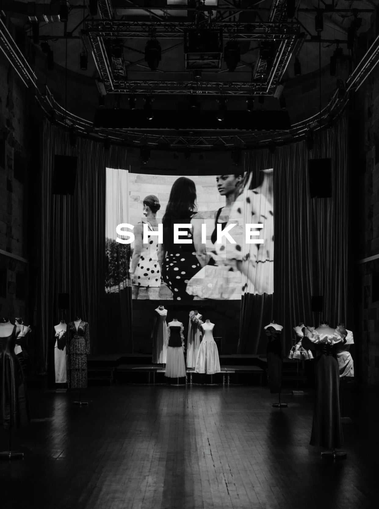
Sheike is a popular clothing and accessories brand that revels in the joy, glamour, and empowerment of fashion. Known for bold prints, stunning colour palettes and an extensive range, Sheike celebrates its customers and inspires them to make every experience special.
The brief
A new look, rolled out in stages
The brief was a new look and concept upgrade for Sheike stores, beginning with their boutique at Chadstone Shopping Centre in Melbourne. We planned the staged rollout across both new and existing stores - in partial and complete phases.
This meant introducing a new range of fixtures that would offer greater flexibility, and finding opportunities to improve store flow and operational efficiency. To identify the key issues, we visited four existing stores to observe how customers shopped, then interviewed them about their experience.
Research
User research
Listening in-store
Sheike’s branding is vibrant, bold, empowering and joyful - perfectly reflecting its high-quality products. But that promise was undermined by an in-store experience that felt visually outdated and failed to communicate the brand’s energetic message.
To understand exactly where it fell short, we visited four existing stores and drew on three methods:
Observations
Staff interviews
Customer feedback
In their own words
I used to always pass by the physical stores thinking they sold boring office wear. It wasn’t until I looked at the dresses properly that I realised they have really fancy event clothing.
I don’t really like their change rooms… the curtains are really hard to drag across, I trip over the heels they have on the floor and there’s not enough places to hang stuff.
They have nice jewellery but I always forget about this until I’m at the checkout counter. By then, I can’t be bothered to ask the staff to take them out from the counter…
The existing stores
What the stores looked like before
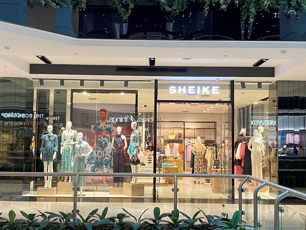
Across the four stores we visited, the same picture emerged: dated black-rail fixtures, cooler lighting and a plain fitout that read as “office wear” - a long way from the bold, joyful brand.
User journey map
Where the experience dipped
Mapping the journey from discovery through to post-purchase surfaced exactly where the experience broke down - a confusing store layout, a disconnect between the website and the physical space, and an unwelcoming change-room area.
The problem
Three things holding the store back
General user sentiment, the observations and the interviews consolidated into three clear problem areas.
Fitout misaligned with branding
- Looks old and outdated
- Gives an office-wear vibe
- Feels cheap
Subpar store experience
- Poor lighting
- Unremarkable visual merchandising
- Cold and uninviting change rooms
Missed opportunities
- Jewellery section feels like an afterthought
- Current fixtures limit product display
- Poor integration of technology like screens
The Solution
Addressing user needs
A store that feels like the brand
A complete redesign and rollout that enhances the in-store experience, aligns with the brand, and creates a space where customers feel confident, happy and connected to the brand in a meaningful way.
A new set of fixtures
A streamlined layout
Elevated lighting
Integrated screens
A brand-aligned concept
The concept
Conchoidal forms & a museum-like base
The concept is centred around conchoidal forms - a scalloped shape that evokes a sense of enveloping or embracing. It reflects Sheike’s brand values: loving, social, detailed and timeless.
Taking a museum-like approach, the base acts as a blank canvas that pushes the products to the foreground. Modular frames blend seamlessly into the background, providing numerous ways to showcase items thoughtfully.
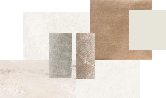
The terracotta colour - chosen after careful consideration - is bright, welcoming and feminine, evoking a European feel that aligns perfectly with the brand. Warm, natural tones and materials create an inviting, polished, aspirational atmosphere.
Sketches to Store
Sketches
Exploring the concept by hand
Rough sketches were created to explore early layouts, forms and fixtures - from the terracotta-and-white-base palette and screen backdrops to the change-room zones and modular display frames.
Renders & details
From renders to construction drawings
The sketches were developed into renders and construction drawings to flesh out the details - resolving the fixtures, finishes and dimensions ready for manufacture.
The finished store
The concept, built
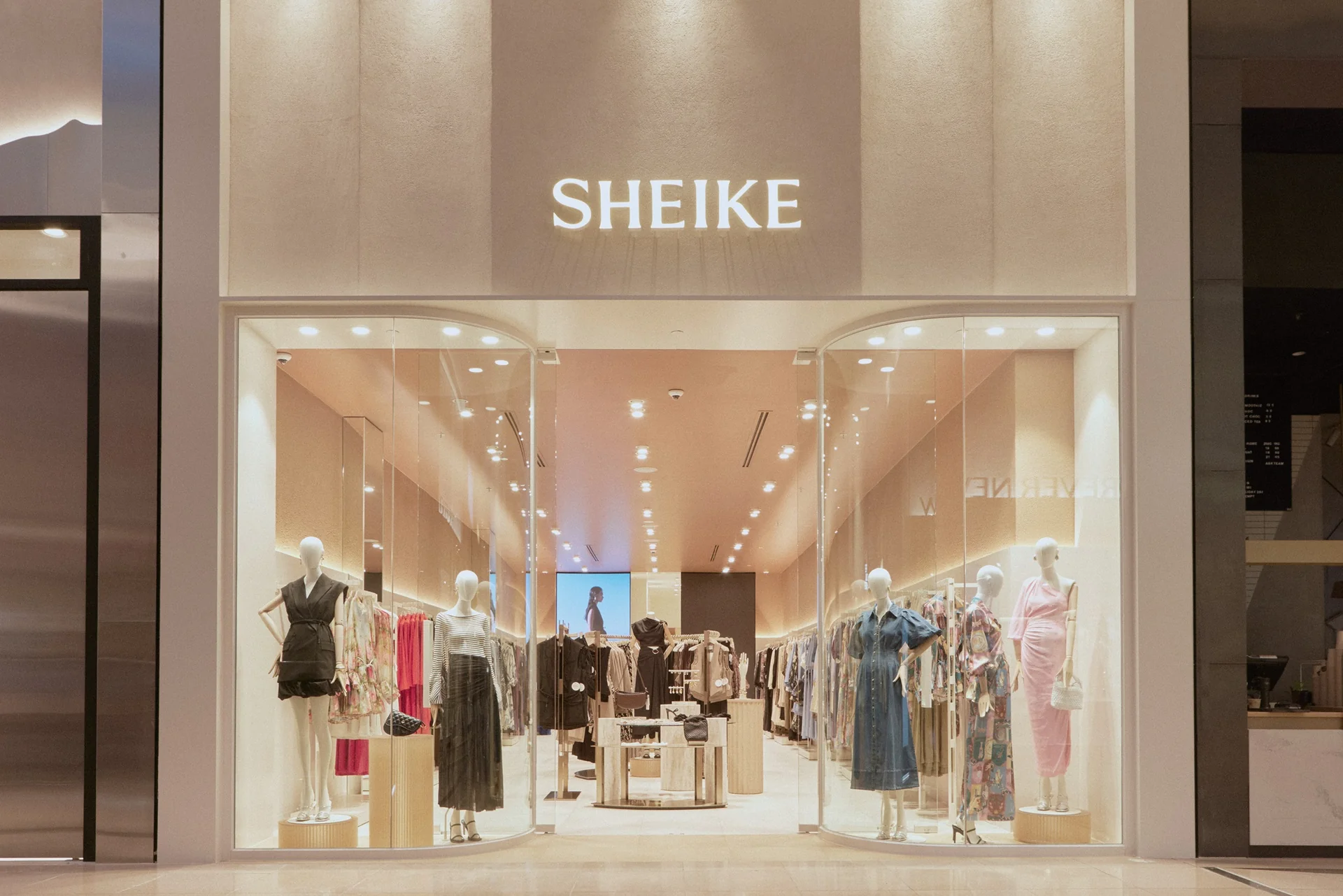
The redesign came to life at Chadstone - a warm, welcoming space with elevated lighting, modular fixtures, a considered jewellery display and change rooms that finally match the quality of the products. Click any photo to open the gallery and browse through.
Results & Impact
Key outcomes
A store that performs
Once the refreshed concept opened at Chadstone, the redesign delivered measurable improvements across both the customer experience and day-to-day operations.
Longer dwell time
Greater staff efficiency
Higher conversion
Feedback
In their own words
The response from shoppers and staff confirmed the space was landing - a store that felt calm even at its busiest, encouraged return visits, and gave the team the flexibility they’d been missing.
The store also looked immaculate even though it was super busy!
Unfortunately the items I wanted were not available in store so I will purchase online, however I will travel to shop in this store again as it was such a pleasant experience!
The new fixture system gives me so much flexibility when deciding how to display the products.
Key takeaway
Beyond aesthetics
This project showed me how service-design principles can elevate an interior space beyond aesthetics. By connecting customer needs with business objectives, the store evolved from a purely transactional environment into a meaningful brand touchpoint - one that drives engagement and loyalty.
Looking back, weaving more co-creative feedback from staff and customers into the ideation phase could have strengthened the outcome further, refining the concept through more iterative rounds.