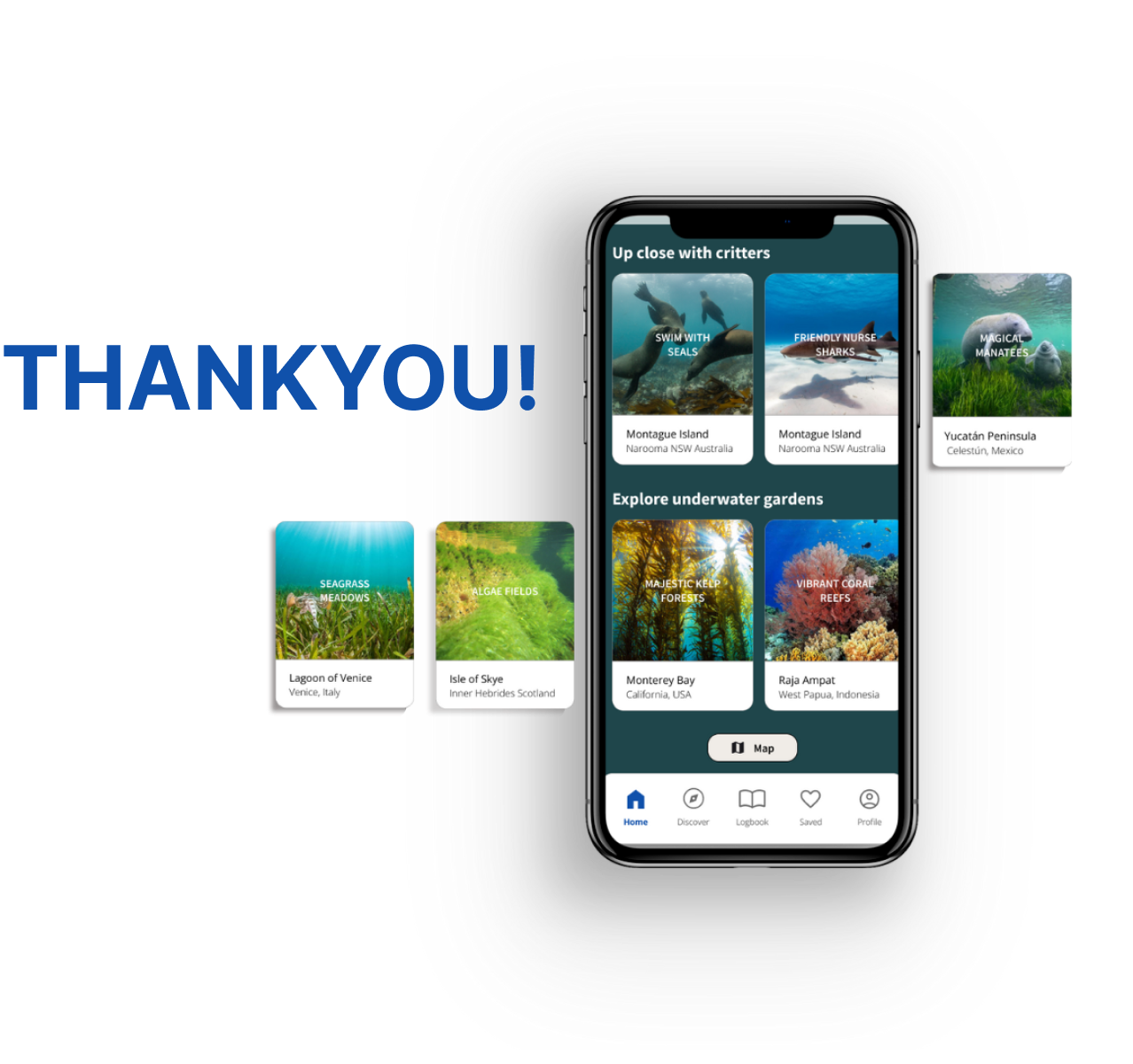
UX/UI Design · Concept · 2024
Submerge
Submerge is an MVP concept for a snorkel and scuba dive location guide, addressing a clear gap in the market. Designed end-to-end, it started as a mobile app and was progressively enhanced into a responsive website, ensuring a seamless experience across devices.
Role
Product Designer
Toolkit
Figma, Figjam, Pencil + Paper
Date
December 2024
Status
Concept
Responsibilities
- User research & interviews
- User flows & information architecture
- Low and high fidelity prototyping
- Usability studies
- Iterating on designs
- Accounting for accessibility
- Responsive design for mobile, tablet & desktop
Overview

Overview
How it started
The idea for Submerge actually came from a personal frustration.
As an avid snorkeler, I always struggled to plan trips - jumping between different websites, finding outdated information, and realising too late that I'd overlooked important details.
I wondered: was this just me, or did others struggle with it too?
Overview
The problem
Through research, I found that divers and snorkelers faced the same challenges. The key pain points were:
Uncertainty about where to go
- “What options do I have near me?”
- “What's highly rated?”
- “What's safe for my swimming level?”
Frustration with outdated information
- “The photos showed beautiful corals but they're all bleached”
- “The water was so polluted here we couldn't see any fish”
- “The entrance point listed on the website was blocked off”
Missing important details
- “I didn't know there was such a difficult hike to reach the water”
- “It was such a struggle to find parking”
- “The water was freezing - we should have worn a wetsuit”
Skepticism toward promotional content
- “The website says it's good but what do the locals really think?”
- “They're showing all these nice professional photos but is that what we will really see?”
Overview
The solution
Submerge is designed to streamline the entire planning process. The app provides:
All-in-one snorkel and dive planning
Trusted recommendations
Real-time conditions
Authentic visuals from real users bringing trust
Overview
Mockups: The key features of Submerge
Welcome!
Onboarding helps to clarify the app's features, set clear expectations, and enhance user engagement. This is followed by a quick and simple sign up to get started.
Search
Search using auto recommendations, useful filters and voice control. Switch between map view and list view with ease. Clear correlation between a snorkel/dive site and its location gives users context and clarity.
Plan
Easy to understand overview with detailed information and photos allow for comprehensive planning from start to finish.
Save
Save locations for easy access on the go. Download to view information offline at any time.
Research
Research
Understanding the problem
Before designing Submerge, I needed to validate whether other users faced the same frustrations I had. I conducted user research to uncover common pain points and understand how people currently plan trips.
Research goals
Understand users and their motivations
Identify frustrations with looking for locations and planning snorkelling or diving trips
Identify types of unexpected issues during snorkelling or diving trips
Identify useful information to know before and during a snorkel or dive trip
Research
Competitive audit
To understand where Submerge could offer the most value, I analysed existing platforms. I found that most apps primarily functioned as digital dive logbooks, focusing on recording past dives rather than helping users plan new ones. Features for discovering dive locations or providing trip-planning details were often underdeveloped or missing entirely.
Research
User research & key insights
To gain a comprehensive understanding of the potential users for Submerge, I conducted a series of interviews. The participants ranged from occasional divers and snorkelers to dedicated hobbyists, providing a broad perspective on the challenges they face. The results revealed key insights, which I've highlighted with direct quotes from participants.
“I'm always unsure if the locations are suitable for my experience level - would be nice if there was a scale that you can refer to so you can gauge how difficult it is”
Insight 01: People aren't sure where to go
“I was so excited to see the beautiful reef pictured on the website but the coral was so badly bleached - clearly the information was really outdated”
Insight 02: Outdated information creates frustration
“Feels like a waste when you go to all the effort of preparing the gear only to find out the water is too murky to see anything - there's so many important factors to consider”
Insight 03: It's easy to miss details in the planning process
“Of course the tourism website has all these fancy photos but I doubt that's what you actually see when you're there...”
Insight 04: Skepticism toward promotional content
Research
Understanding users
After uncovering key insights, I wanted to better understand who my users were and how they interact with the process of planning. To do this, I created user personas and a user journey map which helped translate the research into clear, actionable steps for design.
Problem statements
Jess Lendel
As a moderate swimmer who enjoys snorkelling recreationally, Jess needs a simple consolidated guide that allows her to get a comprehensive overview and save key information quickly. That way she can discover new places and determine if a location is suitable for her to enjoy safely at her experience level and feel secure and prepared during her underwater adventures.
Adem Çelik
As a scuba diver who lives far from the coast, Adem needs a reliable and thorough planning tool with real-time updates so he can prepare adequately to ensure a safe and fulfilling diving experience and to prevent disappointment after investing significant time and effort into trip planning.
Research
User journey map
By visually representing the persona's experience as they navigate the process of planning and carrying out a snorkel trip, I could clearly see opportunities to make the process smoother and more enjoyable.
Design
Design
Information architecture
After gathering key insights from user research, I moved on to structuring the app's content and defining how users would interact with it. This led to the creation of the Information Architecture and User Flows, ensuring the app would be both intuitive and efficient for users.
Design
Low fidelity concepts
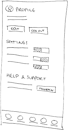
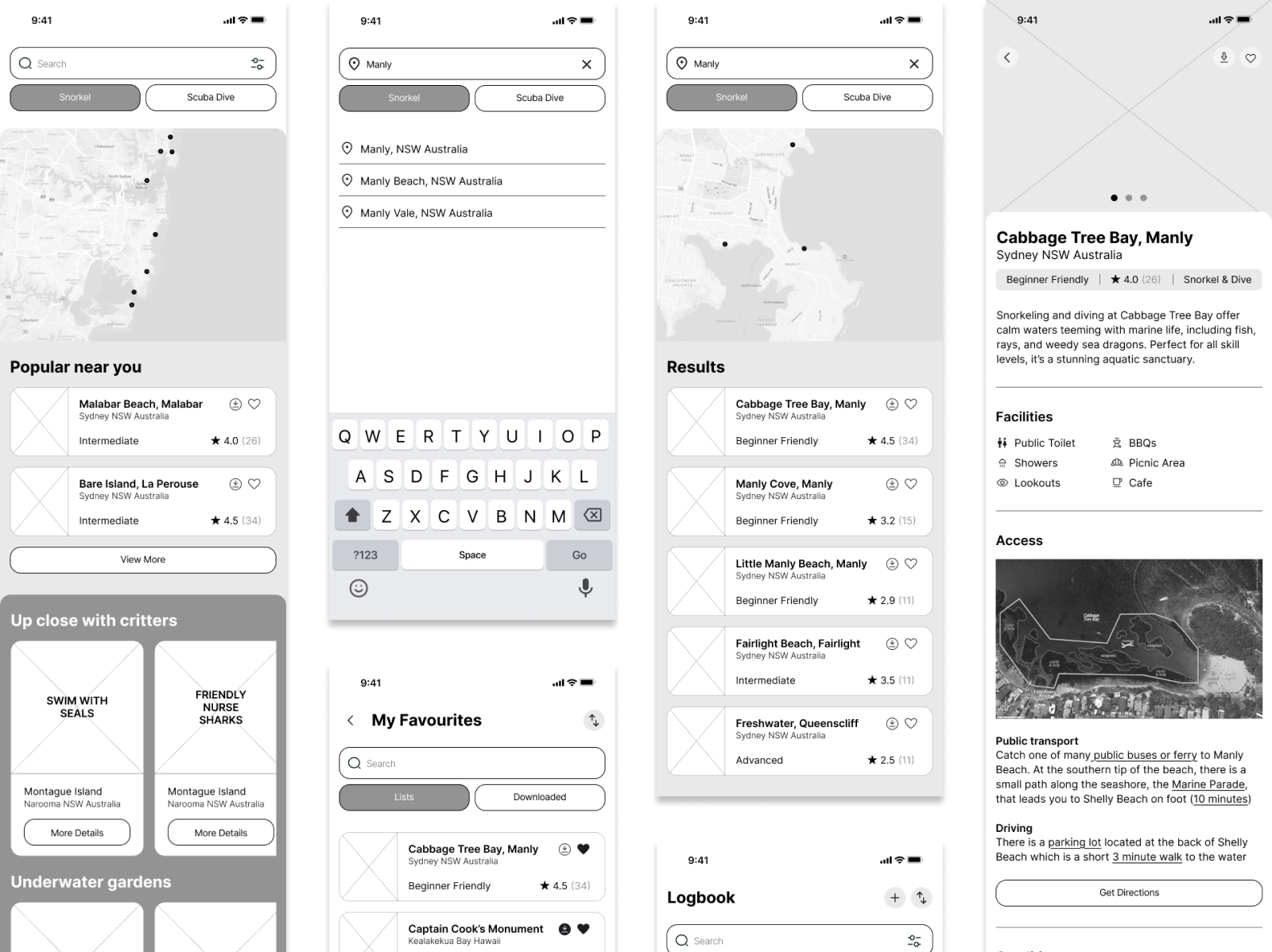
Having established a solid foundation by understanding user pain points and core navigation, I transitioned to the ideation, creating paper wireframe sketches to explore initial concepts for content layout.
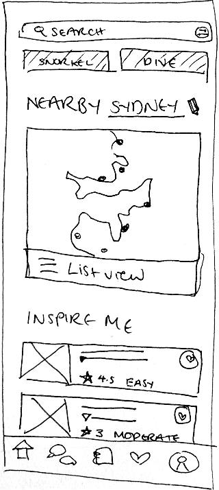
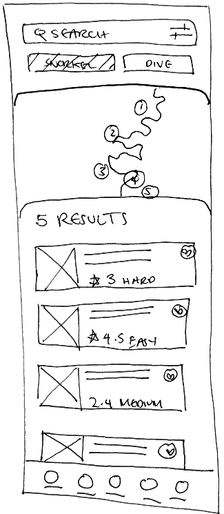
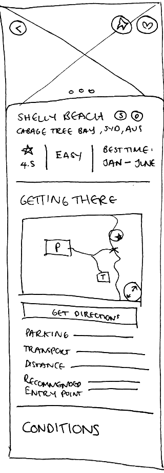
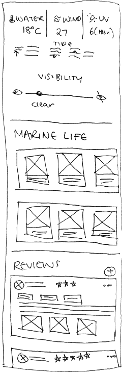
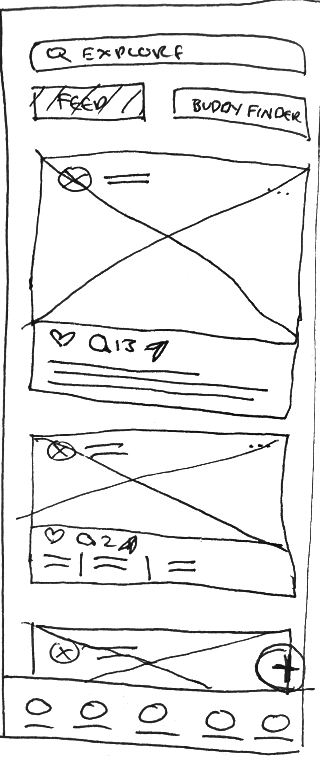
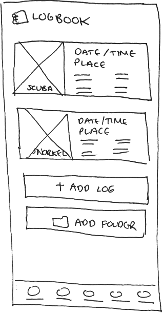
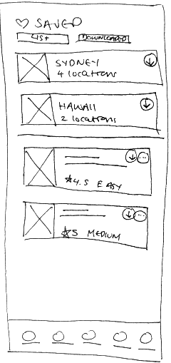
These were then iteratively refined and translated into low fidelity wireframes in Figma.
Testing
Testing
Feedback and validation
With low-fi wireframes in place, it was crucial to test their effectiveness with real users. I conducted usability tests on six different participants who were asked to ‘think aloud’ as they used the app to try and plan for a snorkel trip.
Research goals
- To confirm if the app helps to reduce the time and complexity for users to find a suitable location and plan for their trip
- To figure out if the layout and navigation is clear, intuitive and easy to use
- To see whether the process is consistent with user expectations
- To find out if the tools, functions and type of information provided are useful for users
- To uncover pain points and product opportunities
Testing
Affinity map
The observations from the moderated study were organised into an Affinity Diagram, revealing underlying themes and patterns.
Testing
Insights & iteration
Onboarding
Priority P0It was observed that 5 out of 6 participants were unsure or confused about certain features of the app. This means there is a lack of clarity in understanding how to use the app's features for most users.
Insight: Introducing an onboarding process would help clarify the app's features, set clear expectations, and enhance user engagement.
Maps & diagrams
Priority P0It was observed that 5 out of 6 participants had difficulty interacting with maps and diagrams to try and understand the information better. This means the interaction design for maps and diagrams impacted the visual clarity of the content for most users.
Insight: The interaction design of maps and diagrams should be improved to align with user expectations, providing better context and clarity.
Before
After
Functional consistency
Priority P1It was observed that 3 out of 6 participants were confused by the buttons under the search bar. This means there is a lack of functional consistency which subverts user expectations for some users.
Insight: Buttons with different functions should have distinct designs to prevent user confusion.
Before
After
Checkbox
Clearly indicates the button works as a selection to filter information.
Before
After
Tab design
Indicates you can switch between each option.
Touch target accessibility
Priority P1It was observed that 4 out of 6 participants experienced difficulty with interacting with some of the secondary buttons. This means that some of the secondary buttons are not accessible for most users.
Insight: All touch targets need to be made more accessible through their size and positioning.
Before
After
Larger button size
Useful details
Priority P2It was observed that 4 out of 6 participants commented on details they would have liked to have seen. This means there are missing details that can help with planning for a snorkel or dive trip for most users.
Insight: There needs to be additional details so users can plan and carry out their trip better.
Refine
Refine
High fidelity prototype
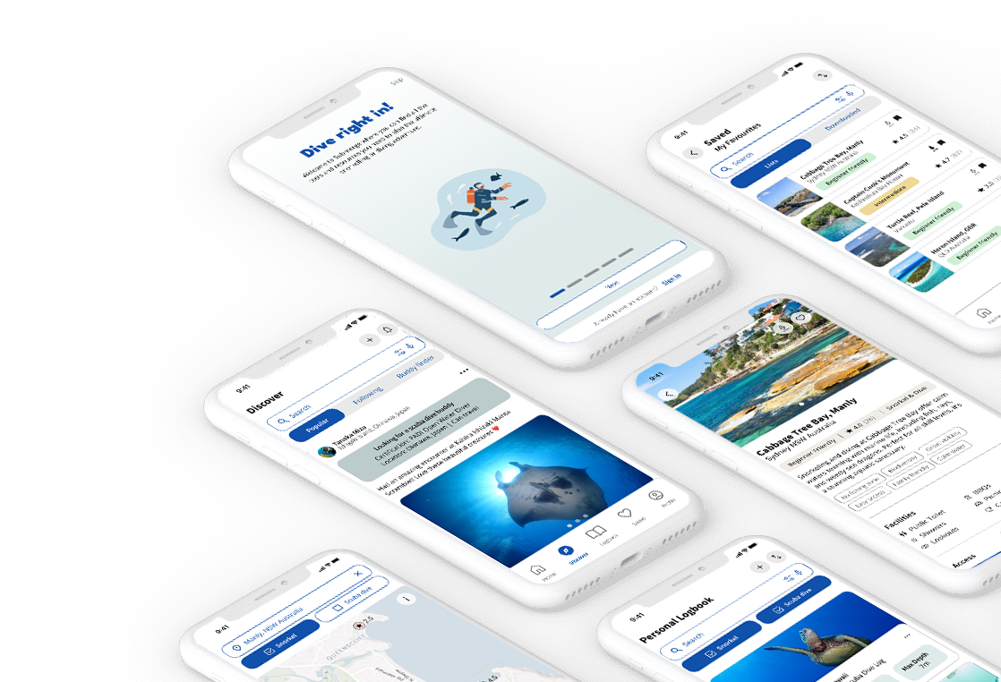
Taking these insights into account, the design was refined and evolved into a high-fidelity prototype - take a look!
Refine
Design system
To ensure consistency, efficiency, and scalability, I developed a design system that streamlined the transition to responsive design.
Refine
Responsive design
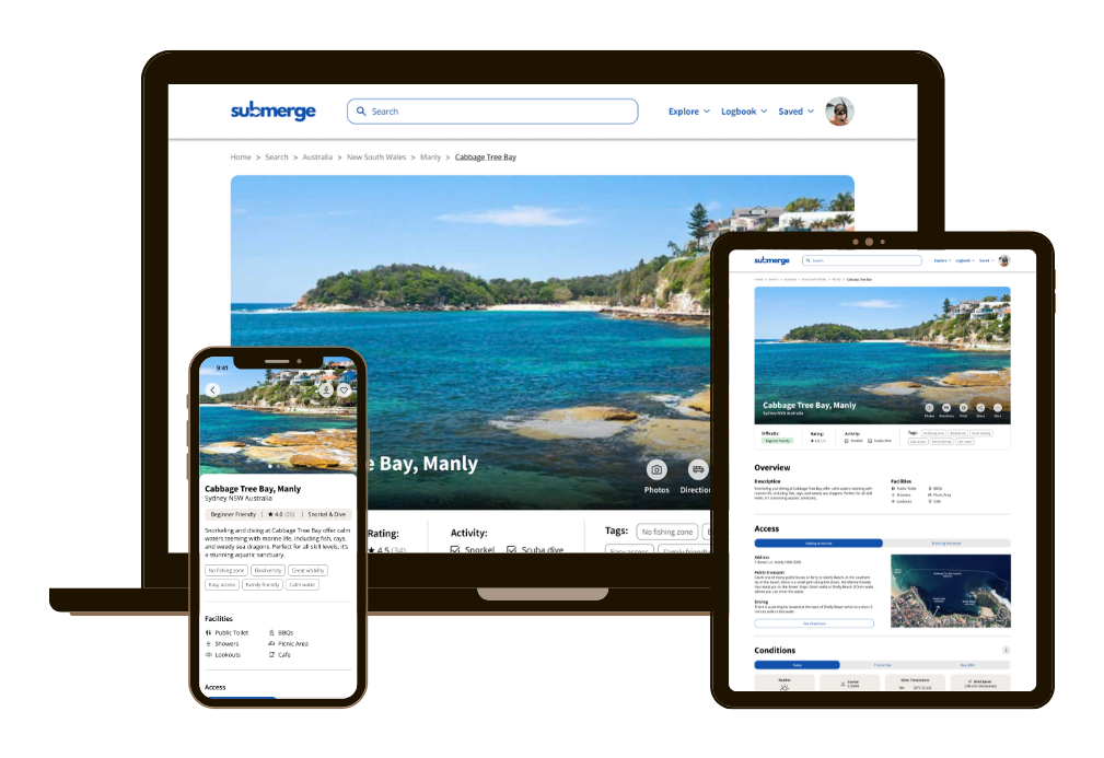
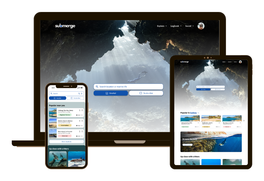
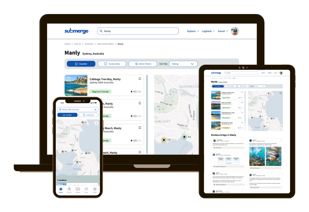
Since Submerge will primarily be used on mobile devices, adopting a mobile-first philosophy was a logical choice. This approach enabled a sharper focus on core functionalities and the prioritisation of essential elements, laying the foundation for progressively enhancing the design to create a responsive experience for desktop and tablet users.
Refine
Accessibility considerations
To make the app as inclusive as possible, I integrated accessibility considerations into the design process, including:
Search by voice
Supports individuals with permanent, temporary, or situational disabilities by providing an easier way to access search results without typing.
Preferences
Accessibility preferences, such as language and measurement units, can be adjusted in the settings. This allows each user to tailor the app to their needs which ensures Submerge is inclusive and adaptable to a broader audience.
Responsive design
Different users may depend on specific devices based on their physical or cognitive abilities. A responsive design accommodates these diverse needs.
Offline access
Users can download information for offline access, which benefits various needs. This includes users with slow or unstable internet connections, as well as those with motor disabilities, for whom preloaded data may provide a smoother experience.
Impact & takeaways
Impact & takeaways
User testing results
I was pleasantly surprised by the significant improvements between the low-fi and high-fi stages, especially in terms of user satisfaction and usability. To measure this, I conducted SUS (System Usability Scale) and CSAT (Customer Satisfaction) surveys after usability tests at both stages. The results showed noticeable improvements, with users praising the app's intuitive interface and overall ease of use.
Positive user feedback
“As someone who doesn't want to go to multiple pages to plan my scuba dive trip this app is a gamechanger! I have everything I need in one place”
“The review section is so useful...you can read helpful insights and because you can see the date of when they wrote it you can check if it's still relevant”
“I love that the app makes it easy for you to compare different places and I can tell at a glance what is suitable for my swimming level”
Impact & takeaways
Project takeaways
Through this project, I gained valuable insights into how users interact with different types of content. Maps, diagrams, and photos engage users in ways that are fundamentally different from text, requiring thoughtful design to ensure they convey the necessary information effectively.
I also came to appreciate the critical role of onboarding. Information that seemed obvious to me as a designer was often overlooked by users. Even the most useful and innovative features can become irrelevant if users are unaware of their existence or unsure how to use them. Ensuring clear, intuitive onboarding is key to maximizing the value of any product.
Next steps
Integration with wearables
Enable the app to integrate with wearable devices, such as the Apple Watch, transforming them into functional dive computers.
Community features
To promote active participation and cultivate a more vibrant and supportive community, the app can build on the existing social features like implementing additional safety features for the 'find a buddy' function.
Introducing subscription tiers
Implementing multiple tiers of paid subscriptions will enable the app to consistently enhance content quality and ensure greater reliability for users.